Showing posts with label sketching. Show all posts

Thursday, September 21, 2017

Current New, September 2017

Summer's end was so busy with life that I have not written since 
the painted cookies experience.
However, there are now several exhibits that have been opening 
or are beginning to have receptions.

At the BlackRock Center for the Arts in Germantown, Maryland 
there is a wonderful show by Andrea Uravitch titled Land, Sea, and Air.
Accompanying her show are the New Image artists.
The following are the art works I have in this exhibit 
that began September 16 and will continue until October 28, 2017

A SEASONAL SPECTRUM is 21 inches high by 55.5 inches wide.
 In this detail you can see an embroidered couple of images of my hands
holding and stitching a tree. This was to represent natures studio, but
mine always has a cup of coffee and perhaps something to eat.

 A CLASSICAL PALETTE is 31 inches high by 41 inches wide 
 Again I have an embroidered hand painting the leaves of nature 
for the fall season. 
There are some painted branches on the background and 
the leaves are all embroidered.
 Part of this exhibit had a hall full of 12 by 12 inch works 
by all of us (New Image members) that accompanied this show.
Mine is titled ALONE AT LAKE ARROWHEAD,
embroidery on a painted background.

On Saturday, September 23, 2017 there will be the reception for our
New Image Artists exhibit of new work 
at the Virginia Quilt Museum in Harrisonburg, Virginia. 
The reception begins at 11 AM and will continue until 4 PM.

My two artworks in the show are:
CONVERSATIONS, 30 inches high by 40 inches wide.
 This has layers of embroidered images to give us a look at 
conversations among couples. Conversations seems to be leaving our 
time, voices and vocabularies and being replaced by Texting.
On the black(green)board in the classroom it says,
"No Cell Phones, No Instant Messaging, No Texting, No E-mails" 
Many of the people I sketched and then embroidered are members 
of the Fogg family. Also included are my husband, our son, and me.

My largest new artwork, SATIRICAL STILLNESS below,
 I reviewed on this blog while I was in the process of creating it.
It is 40 inches high by 51 inches wide. 
As I mentioned at the time, I was trying to get away 
from the realistic embroidery work I had been doing for several years.
Well, I tried and managed to make a lot of flat flowers and leaves.
 However some realism crept in, but I left out shading, 
keeping all the images flat.
I still am enamored by all the Dutch and Flemish still-life masterpieces
This is my reference to those artists who always had 
many bugs and insect crawling around
on their gorgeously painted flowers and fruit. 
SATIRICAL STILLNESS used many different kinds of fabric, 
pieced together and then embroidered. 
The leaves were all sewn down on the center vein 
and then left to extend away from the background.
This exhibit at the Virginia Quilt Museum will continue 
until December 16, 2017

Sunday, November 6, 2016

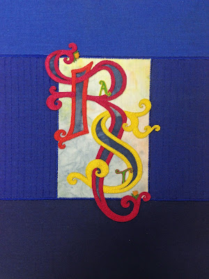
The Anatomy of a Commission

Late in August I was contacted by Ginny Friend about creating a small 
commission as a gift for a 'retiring' curator (Rebecca Stevens) 
from the GWU &Textile Museum.
Jeanne Benson had drawn and painted several 'illuminated' letters 
and I thought, "why not try embroidering initials" as a sort of illuminated
theme. I started sketching with the R and S of Rebecca's name.
And, I did a lot of sketching. Many of these are on tracing paper.

 Rebecca Stevens full initials are R.A.T. S. I decided to make the 
A and T small and include them within the R and S.
 Further drawing and I decided to make a pattern 
of the centers of each letters to be cut out. 
This way I would be able to try different colors inside the outlines.
 While continuing to plan I sketched in some shading
 to get a feeling of color placement
 The theme for the evening of this presentation was blue and white shibori.  
Yoshiko Wada would also be given an award at that time. 
Part of the invitation is shown here.
 Cutting out the centers of the two letters I started trying colors.
Here black and white
Then a watery aqua fabric. I tried several more combinations of colors, but.....
Settled on some shibori fabric to be the center of each initial. 
Luckily I have friends who had all created Shibori samples 
and gave them to me. I used most all of one of Joan Dryer's fabrics.
Again this is on paper and I tried the colors for the outlines.
 Some of the shibori samples friends lent me.
 Now came the embellishing of the letters. I started planning how and where 
I would add small images to add to or highlight the initials.
 And, more drawing and planning
 Then thought I'd better embroider the letters to see
 how the small images could be attached.
This first R I decided against. The reds are too dark. 
It turned out I made several attempts at each letter and each of the small images.
 Laying the R and T on three shades of blue before attaching them 
and then working on the small images.
 As I said I started to make these small images and ended 
with two or three not useable. 
As often as I have created many subjects with thread
 on the sewing machine I never realized 
how hard it would be to make tiny ones.
Here I have taped some to the paper drawing 
before permanently sewing them on the embroidered letters..
As you can see images were rearranged and 
not all images were used. Here is the final presentation. 
The butterflies stand up a bit.
 However, since this was to be an award 
I thought Rebecca ought to have an original certificate 
that this gift represented.
I worked out the document on the computer and 
wanted it to be printed on fabric. 
I ironed freezer paper to both silk and cotton to print the certificate
and then my printer failed. 
Finally Dominie Nash printed it for me. Her printer used the
cotton beautifully.
 Still looking at the original invitation with hundreds of the 
white cherry blossoms 
I started embroidering tiny ones to be used to surround the certificate.
Here is my hoop with a few of the many blossoms and some already cut out.
 This then became the back side of the hanging.
There is a small casing at the top if it is to be hung in that manner.
The presentation was made last Thursday evening at a lovely dinner.
I cannot see Rebecca Stevens leaving the Textile Museum 
and I hope she stays on as a consultant as well as on the board.

Thursday, July 3, 2014

Updating my web site: www.BJAdamsArt.com

The last couple of days I/we have been updating my web site. 
That is Jeanne Williamson, my web master(tress), has been 
doing all the technical work along with some suggestions. 
I have been watching, checking, and seeing the changes as they develop.
The web site needed a major overhaul. 
Colors to me, seem to always make the biggest impact.
It is amazing to see how my work changes as the background 
went from black to light blue. 
I know the relation of one color to a neighboring color 
and then add extreme contrast and I was surprised to see the result.
 Besides adding new color, Jeanne added some different work.
This piece, EARLY SKETCH is 9 by 12 inches. 
Free-motion machine embroidery on a commercial fabric. 
Jeanne made a detail for the web site
 to show the stitches but you will have to pull the web site up to see it.
www.BJAdamsArt.com
The design came from a black and white drawing 
I had sketched when I was about 16  years old.
 This piece titled RELAXED TRIPTYCH is 28 by 30 inches.
The embroidery is entirely zig zag stitching on canvas.
The designs were taken from 3 small oil paintings from my 30's 
before I moved into acrylics.
There were several other new pieces added to the web site.
The home page shows a detail of a piece and there is now a 
GALLERY page where you will find all the information about my various series.
This was quite a lengthy adventure and may need a bit of tweaking 
 but for the near future it will stay till new work is added.
Enjoy! 

Monday, September 30, 2013

Colored Pencil and Peppers

The past two weeks have been spent shifting my thinking
 from a PC  laptop to a huge new computer monitor, an iMac.
I am struggling with many issues but think I have been able to add to my blog.

 Several weeks ago I found a lot of these wonderful peppers
 at the Farmers Market and bought many more of them for a dining table centerpiece.
 Taking some of them into the studio I drew this sketch on white paper.
This pen and ink was in a previous blog.
 I no longer have PhotoShop Elements so could not lighten the right side of this photo. 
Before the peppers dried I worked on this colored pencil painting 
using the above reference photo and the actual peppers to capture the bright colors.
Again, without PSE I could not lighten the white background 
of this photo taken by my iPad. 
Perhaps there is someplace on this Mac to accomplish 
what I need but otherwise I may be reinvesting in PhotoShop.

 Saturday I enjoyed a tour through the house and studio by the 
Renwick Alliance. So most of last week was not spent 
learning the iMac but getting ready for the tour. 
Now I will again work at learning by shifting my thinking 
and back to the studio for some much needed creative work.

Friday, August 16, 2013

Ipad Art App Procreate, studies

 In my last blog, I worked with Procreate App, 
but just for simple B & W drawing.
Now I am trying to figure out the many tools available on this App.
From a detail of a bouquet I tried several brushes 
along with the changing and blending colors.
 There are so many sub categories for each tool. Under 'brushes'
the listing includes sketching, inking, painting, airbrushing, textures, and abstract
with more sub categories under each listing as well as size and opacity.
 These are the marks made in the abstract tool which can be 
changed with Dynamics, ie..... speed, 
pressure, jitter, and spacing, besides color, size and opacity.

 Textures as well have the many changeable variations as each brush.
Sub categories under textures are Victorian, wood, cubes, 
diagonal stripes, half tones, grunge, grid, and decimals.
I have to admit that the Victorian texture is my favorite 
and I used it several times.
 Moving a detail of a photo onto a canvas I worked at 
changing much of the image with the various tools.
Under the Sketching tool the sub categories are 
technical pencil, HB pencil, 6B pencil, shading, graphite, 
soft pastel, chalk, and artist crayon. 
 There are so many directions you can go with so many tools
that I feel I have just scratched the surface of this App.
I did use the Victorian texture extensively in this painting, 
changing size, opacity , and color. 
For this teapot of flowers I used the wood texture for the table.
I have decided Procreate needs much more study, 
trial and errors, for me to really be able to make use of
so many tools and their combinations.